ATLAS Tooltips. To help users learn CrossnoKaye’s autonomous control software, I designed tooltips to be the new medium of in-app learning.


Role
UI/UX Design Intern
Team
Nick Mason, Head of Design
Emily Cardanini, Product Manager
Jessica Gibbs, Customer Success
Duration
1 Month
Overview
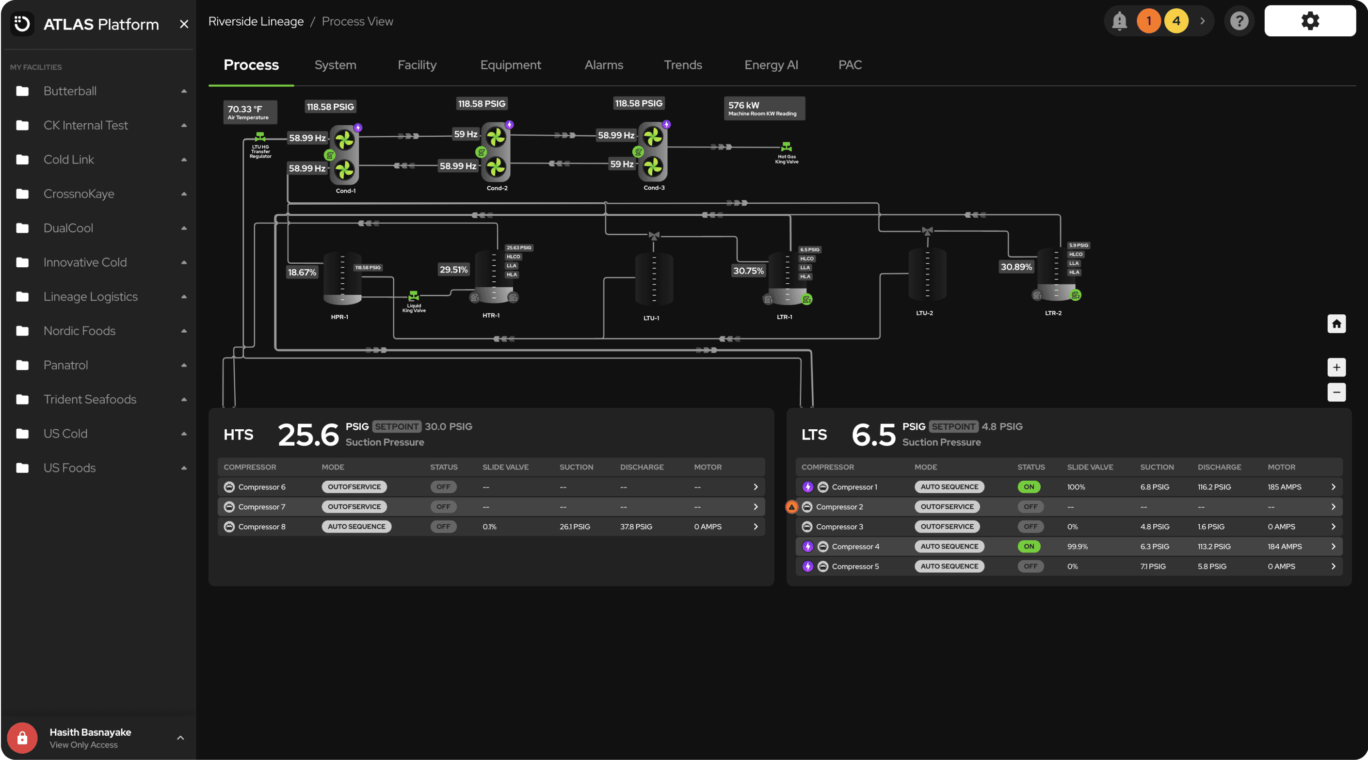
CrossnoKaye's flagship product is a control systems platform called ATLAS.
Built for niche industrial plants, users without domain-specific knowledge struggled to learn the platform with its current onboarding.
As UI/UX Design Intern, I spearheaded and designed tooltips to allow for targeted and comprehensive learning, and redefined the way guides, walkthroughs, and onboarding were delivered in ATLAS.
Problem
Users needed a new way to learn ATLAS — page overviews weren’t cutting it.
The issue wasn’t content, it was format.
Page overviews, large screen-wide popovers, were only great for getting a general overview of the platform. For explaining technical content or highlighting page elements, their format made dispelling targeted and comprehensive information a struggle, a poor choice for a technical platform like ATLAS.

Not taggable, comprehensive, or specific.
Insights from page overviews led to criteria that the new medium of in-app learning would have to satisfy.
Taggable
Page overviews can't be tagged, meaning information wasn't localized to the page elements they were referencing. In-app learning’s new format would need to allow for taggable content.
Comprehensive
Page overviews existed for each page only, not for technical flows or specific animatics. Platform elements were overlooked. In-app learning’s new format would need to be conducive to page-wide guides and extensive walkthroughs.
Specific
Partly a symptom of the above problems, page-overviews weren't conducive to specific content either. In-app learning’s new format would need to allow specific and technical content.
They also didn’t look great.
Not only did page overviews fail to suit the needs of ATLAS users, they also looked out of place compared to the platform as a whole. I audited the existing design and walkthrough navigation to identify areas of improvement.
UI Issues

Doesn't use the platform's color palette
Inconistent spacing issues
White drop shadow on a dark UI
Navigational Issues

No step count.
Lacks a back button.
Iterations
Iterations—going broad to go narrow.
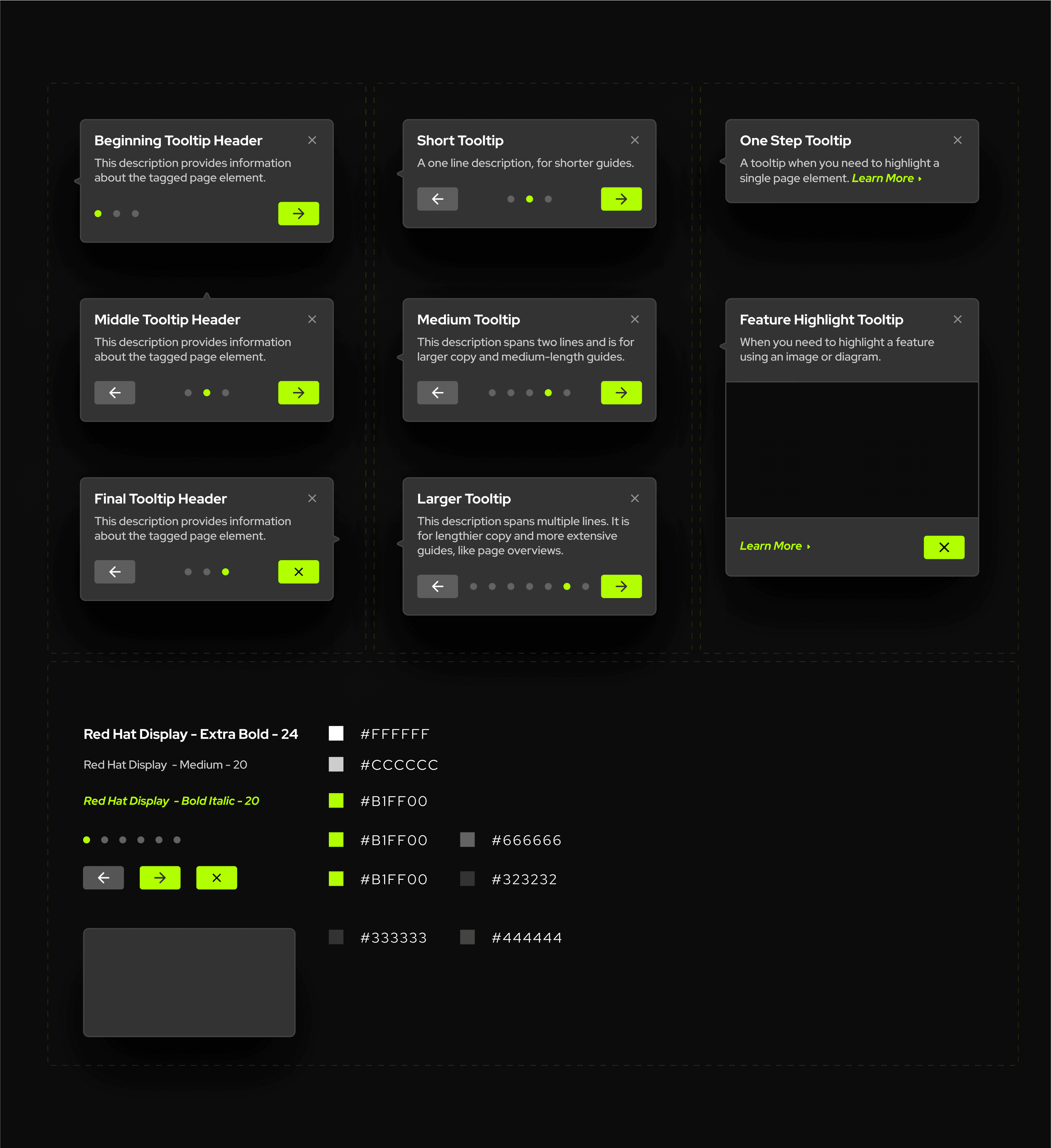
Initial iterations—a myriad of tooltips for different use cases.
The design of tooltips would need to be flexible enough to suit the different use cases of in-app learning found in ATLAS. I began my iterations by going broad, creating designs to suit every use case, with the intention of condensing my designs in later iterations.
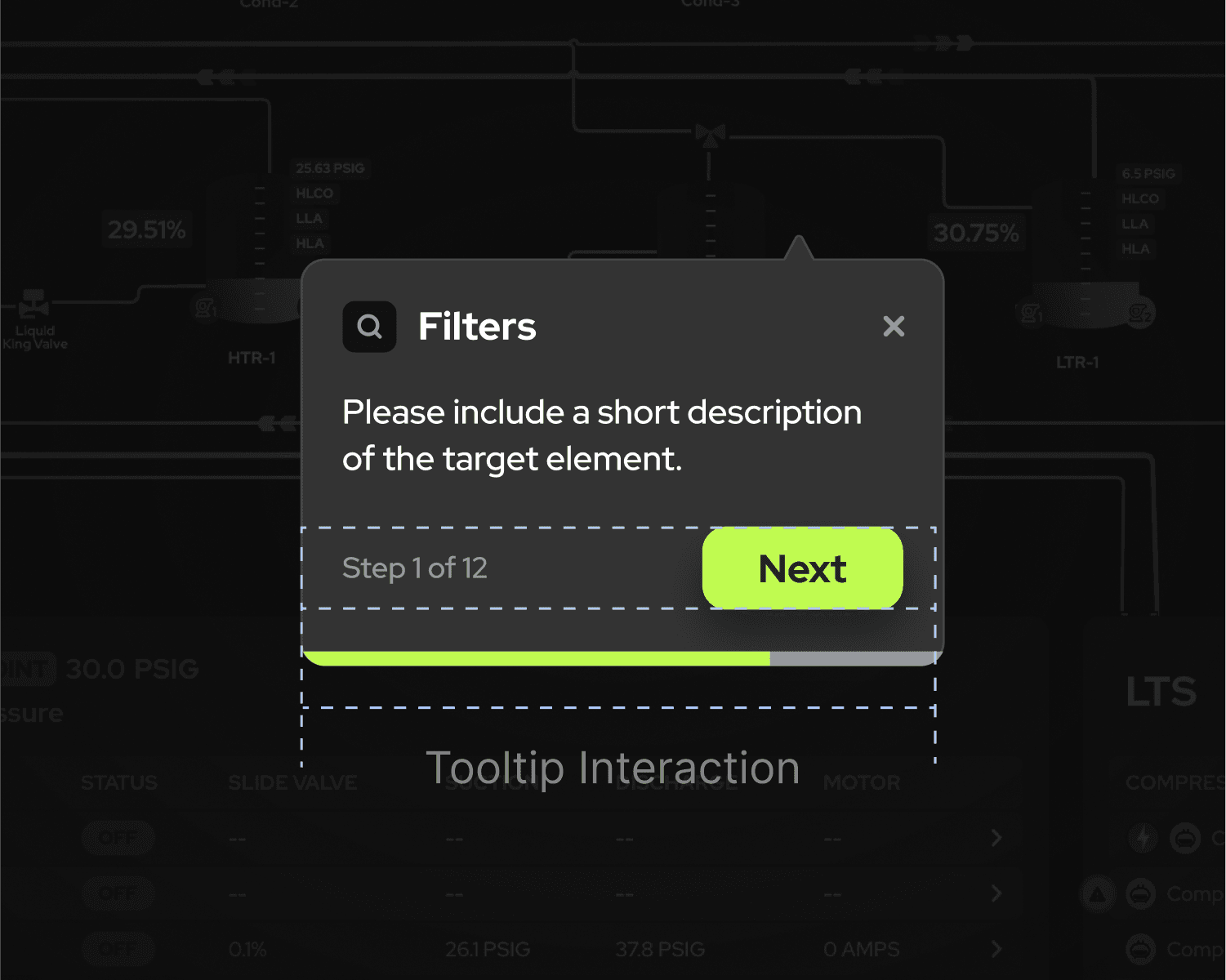
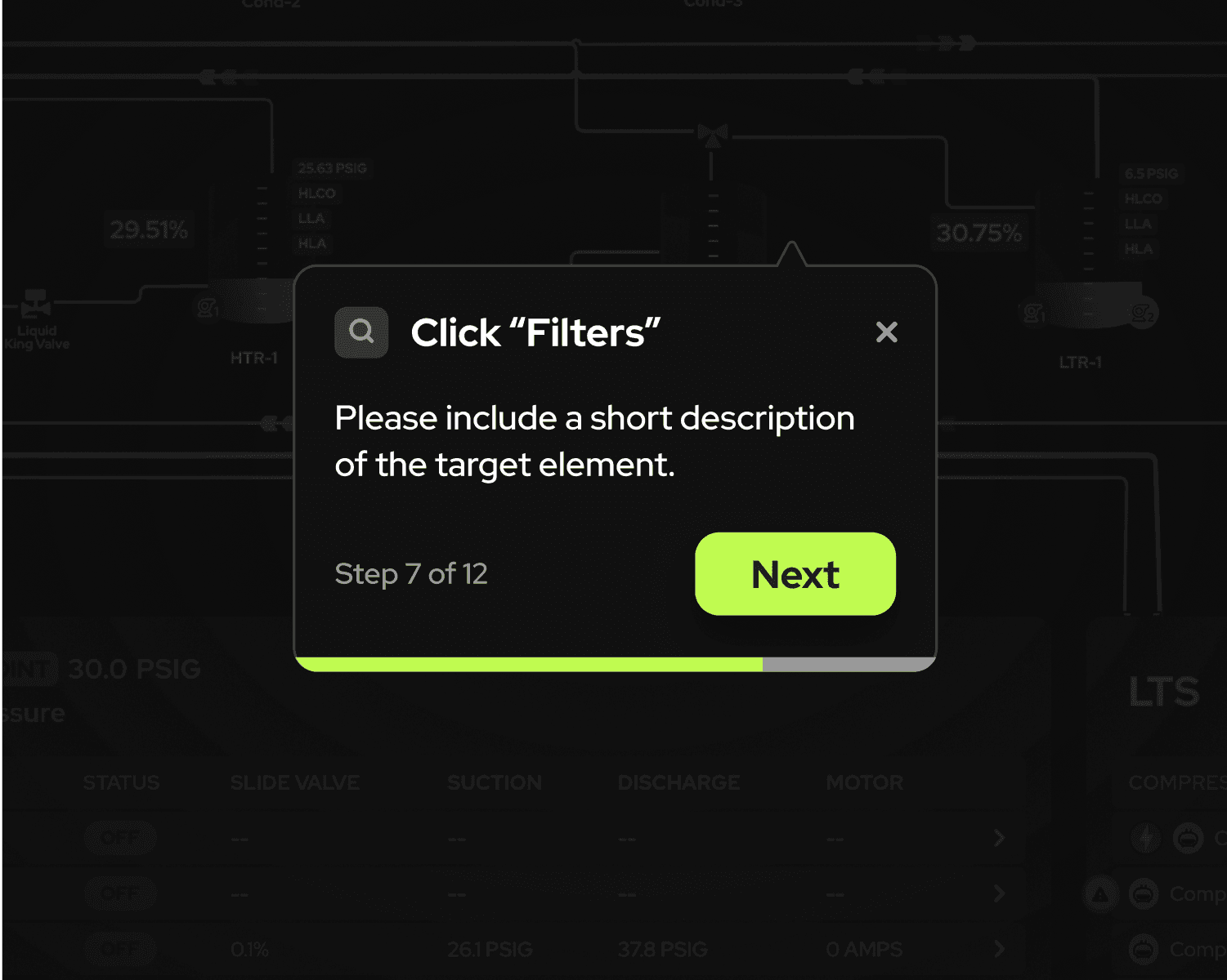
Steppers
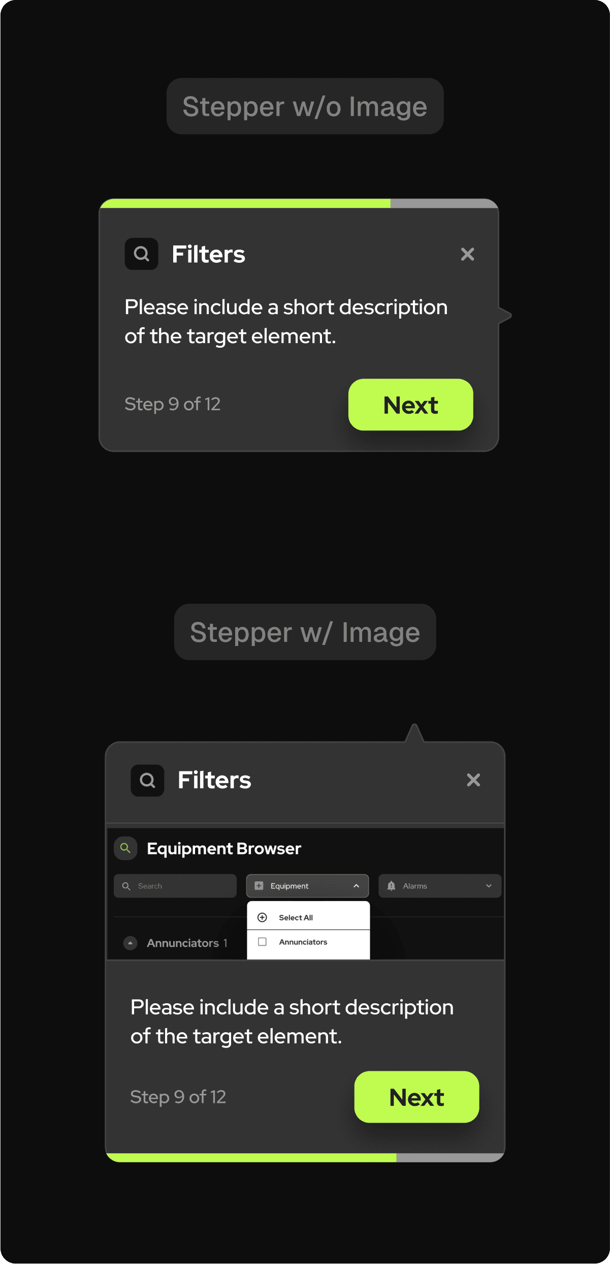
Progress bar and step count provide an indicator of progression and visual flair.
Icons provide clarity and identification.
Visual design matches the branding of ATLAS.
Components should be lightweight, multiple elements may prove an engineering challenge.
Having a step count and progress bar is redundant, and the bar alone isn’t sufficient.
There’s no back button.
Pop-Ups
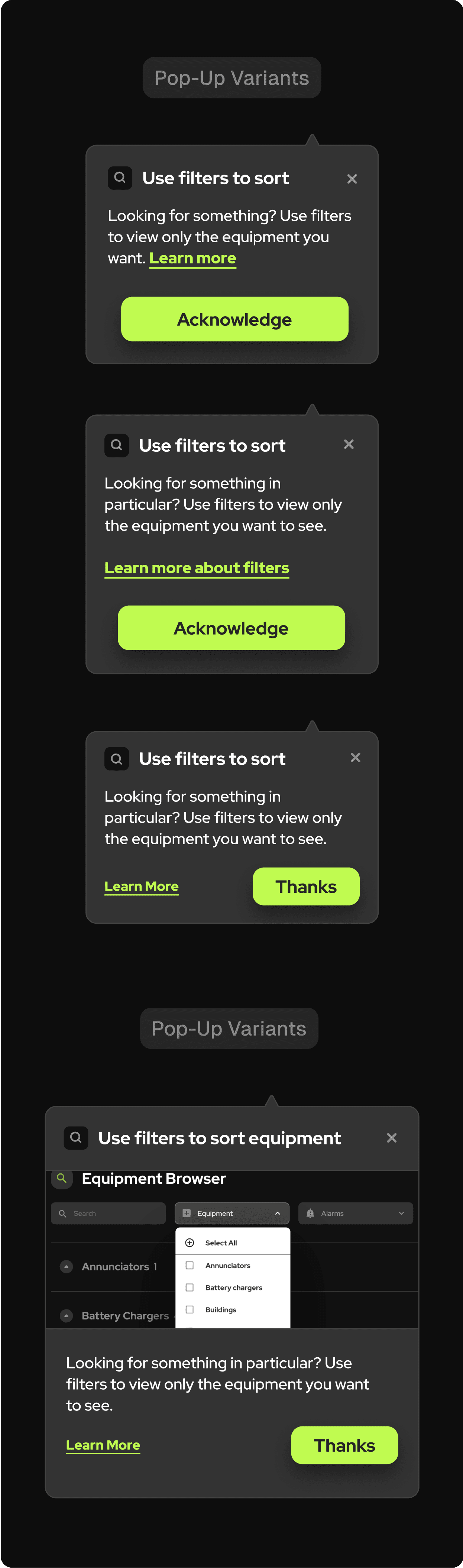
Learn more CTA is prominent and visible, addressing stakeholder need.
A separate “pop-up” variant provides a visual distinction between multi-step guides vs standalone tooltip.
Icons provide clarity and identification.
Text is too small, and the “learn more” CTA may draw attention away from text.
Implementing multiple variants increases engineering workload/upkeep, can we simplify solutions?
A step in the right direction—key design insights from this set of iterations.
These initial iterations helped identify the direction of the final design, and provided opportunity to test and receive feedback on a variety of designs.
From "clicking through"
My old iterations placed the duty on the user to click through the page, in order to advance the guide. The intention was for a more interactive experience, but also meant there was more room for user error or confusion.

After
To a more guided experience
Rather than putting the onus on the user to click through the page, I moved towards simply using call-outs. This was in line with a shift in stakeholder sentiment towards in-page guides, rather than platform-wide guides.
From dark mode
My initial iterations used a darker color palette in order to distinguish the tooltips from page animatics. However, upon layering my designs on screenshots of ATLAS, I realized the opposite was true.
After
To (less) dark mode
I moved towards a grayer palette more in line with the rest of the platform. In order to have the tooltips "pop", I opted for drop shadow. The resulting tooltips stood out, but weren't out of place.

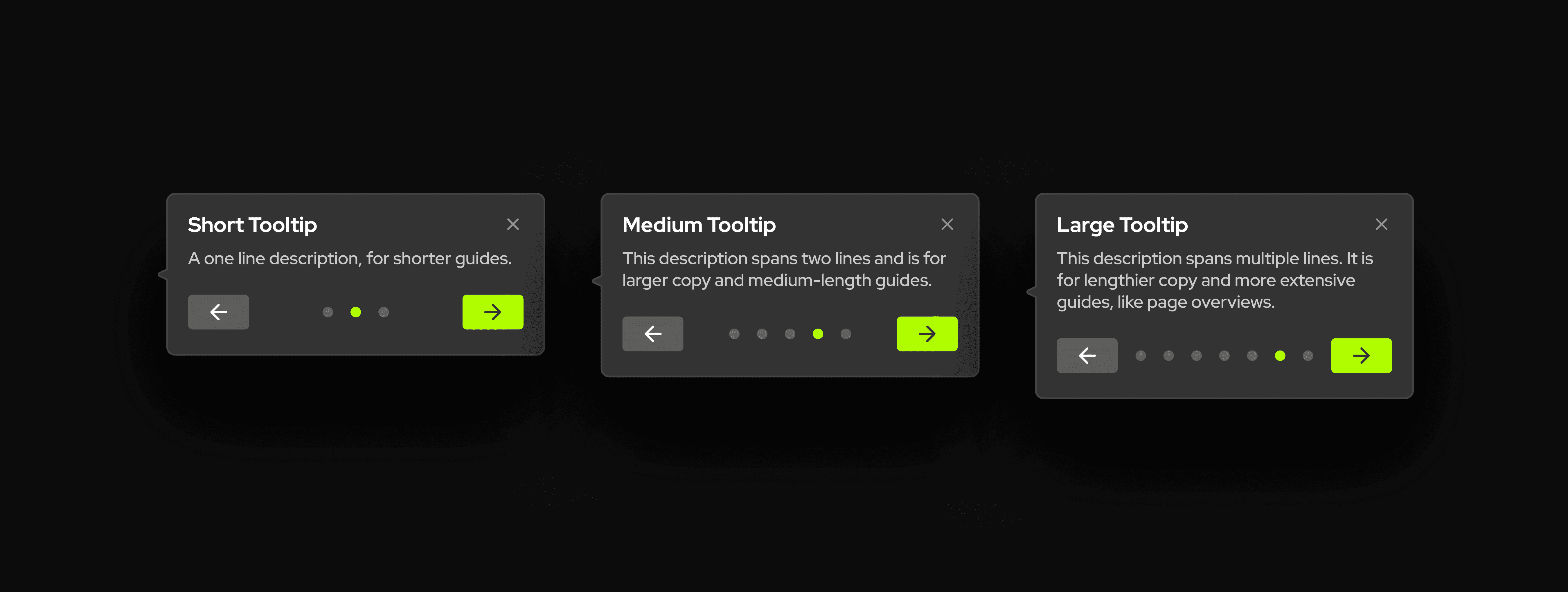
Final Design
Final designs, combining the best of both worlds.
Using the insights from previous iterations to create an all-in-one tooltip.
For the final design, I utilized insights gained from previous iterations and merged the design direction of pop-ups and steppers to create an all-in-one-tooltip design.
Key design decisions I made.
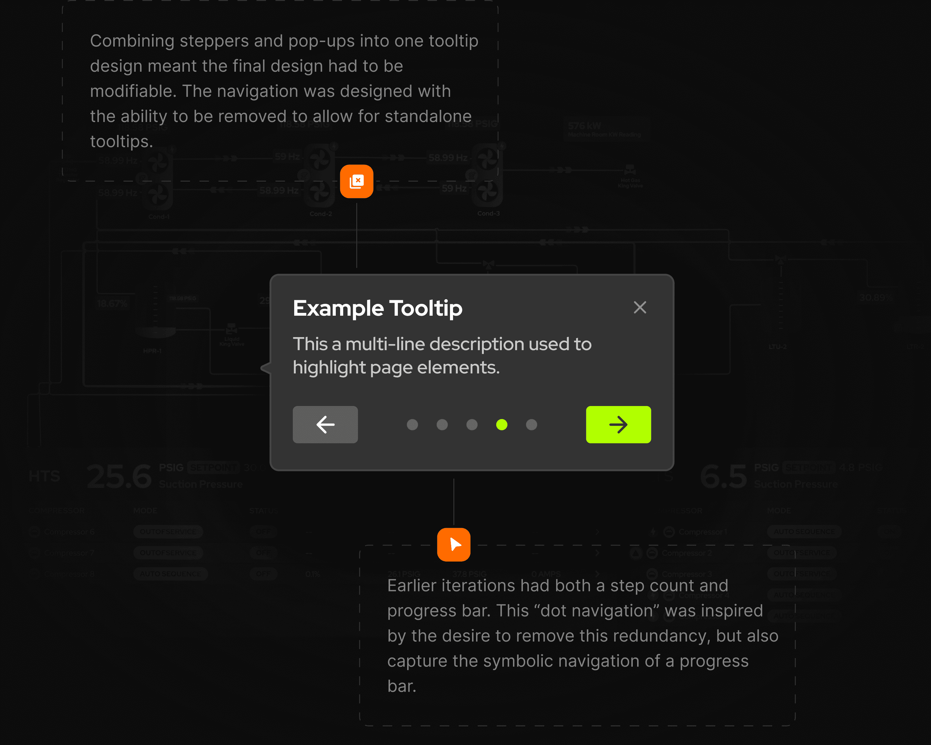
In order to make navigation a more fluid and less cognitively demanding experience, I created a symbolic representation of navigation in my designs, and placed intentional limitations on guide length.
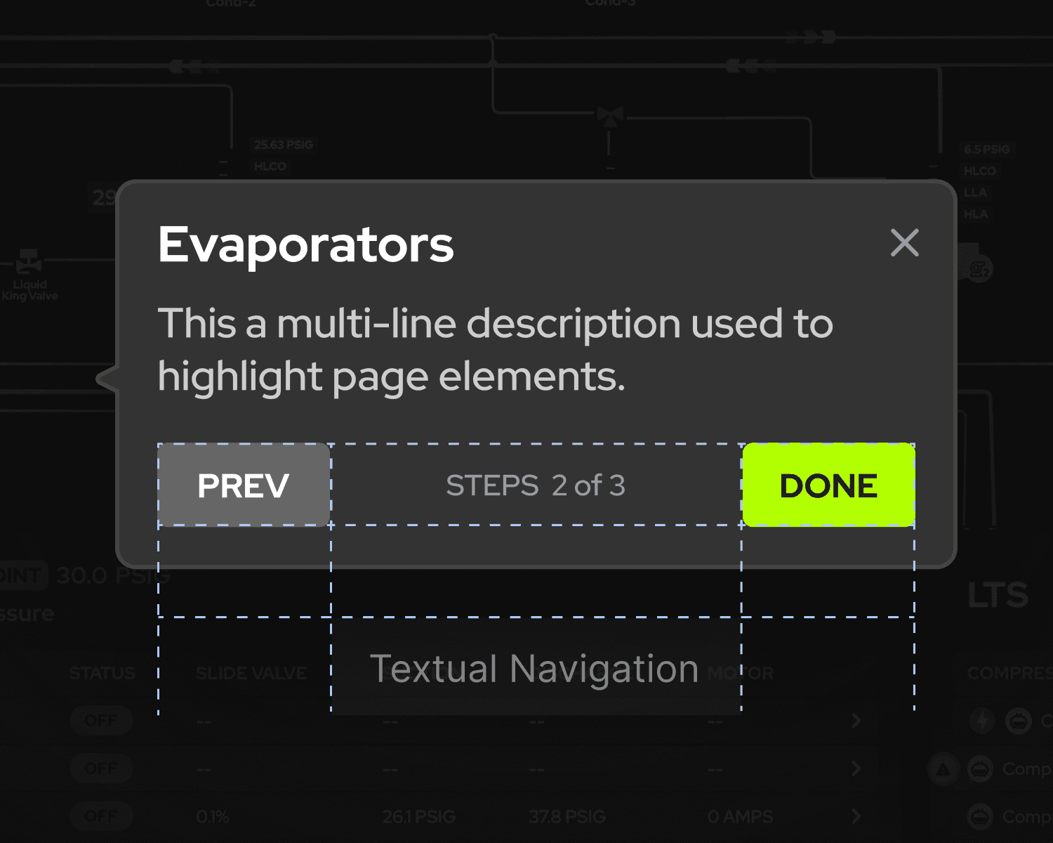
Originally, textual navigation ensured clarity
In my earliest iterations, I used a progress bar and text to highlight progress. However, I decided that design was too redundant and confusing, and moved towards text exclusively.
After
Symbols reduce cognitive load and centers attention on copy
However, as I neared my final iterations, I challenged myself to see if I could reduce the amount of extraneous info on the tooltip to zero, symbols were the solution, completely minimizing cognitive load.

Usage of text allowed for limitless guide length
Using text to display the user's progress within the tooltip allows for virtually unlimited steps. Whether it shows "1 out of 200" or "1 out of 2," the space required remains nearly the same, making it a more flexible option.

After
Placing an intentional limitation on guide length with symbols
Using "dots" to indicate progress in a guide inherently limits the number of steps, as the available space can only accommodate a certain number of dots. This constraint is intentional, and was backed by stakeholders.

Tooltip modularity—designed for every state.
Supporting a burgeoning design system with auto-layout and Figma variants.
While CrossnoKaye didn’t have a dedicated design system, it did have the workings of one. A 5px grid system, a 10px radius; standardizations were beginning to take place.
In order to ensure design consistency, showcase tooltip flexibility, and empower future modifications, I used auto-layout and Figma variants to create the final versions of my designs.

Designing for different states.
In order to encompass the various use cases of in-app learning in ATLAS, I intended my tooltips to be highly modifiable. Below, I’ve showcased each variant, and their different state.


Reflections
An internship of lessons (and office dogs).
A big thank you to the team at CrossnoKaye.
Design has always been a uniquely collaborative process. So I wanted to take the time to thank the mentors, friends, and experiences I gained during my internship at CrossnoKaye.
There’s the little things you learn, from balancing multiple projects, to communicating with stakeholders, but also the lasting understanding of how to structure a design project, take ownership, and make positive steps in your career. I’ve included some of those takeaways below.
Oh, and honorable mention to all the office dogs, who kept me company during my design sessions. And to Eric, who freed me from the office stairwell that one time.
If you know, you know.
Thanks for reading.
Built from scratch with Framer and custom code.
Hasith Basnayake, 2024.